
Nature-Based Education, Reimagined Through Strategy and Design
Project Overview
Objective:
Living Education Academy was conceived as a nature-based learning program for children ages 6–14. The founder needed a complete brand foundation—from positioning and identity through messaging and go-to-market planning—that could balance the freedom of outdoor learning with the credibility parents expect from an educational program.
My Role:
Creative Director and Brand Strategist. I independently led and executed the full engagement, including discovery, competitive and audience research, positioning, visual identity, brand voice and messaging, logo validation, brand guidelines, and go-to-market planning. I worked directly with the founder as the sole stakeholder and served as the final creative decision-maker.
Deliverables:
- Brand Strategy Blueprint
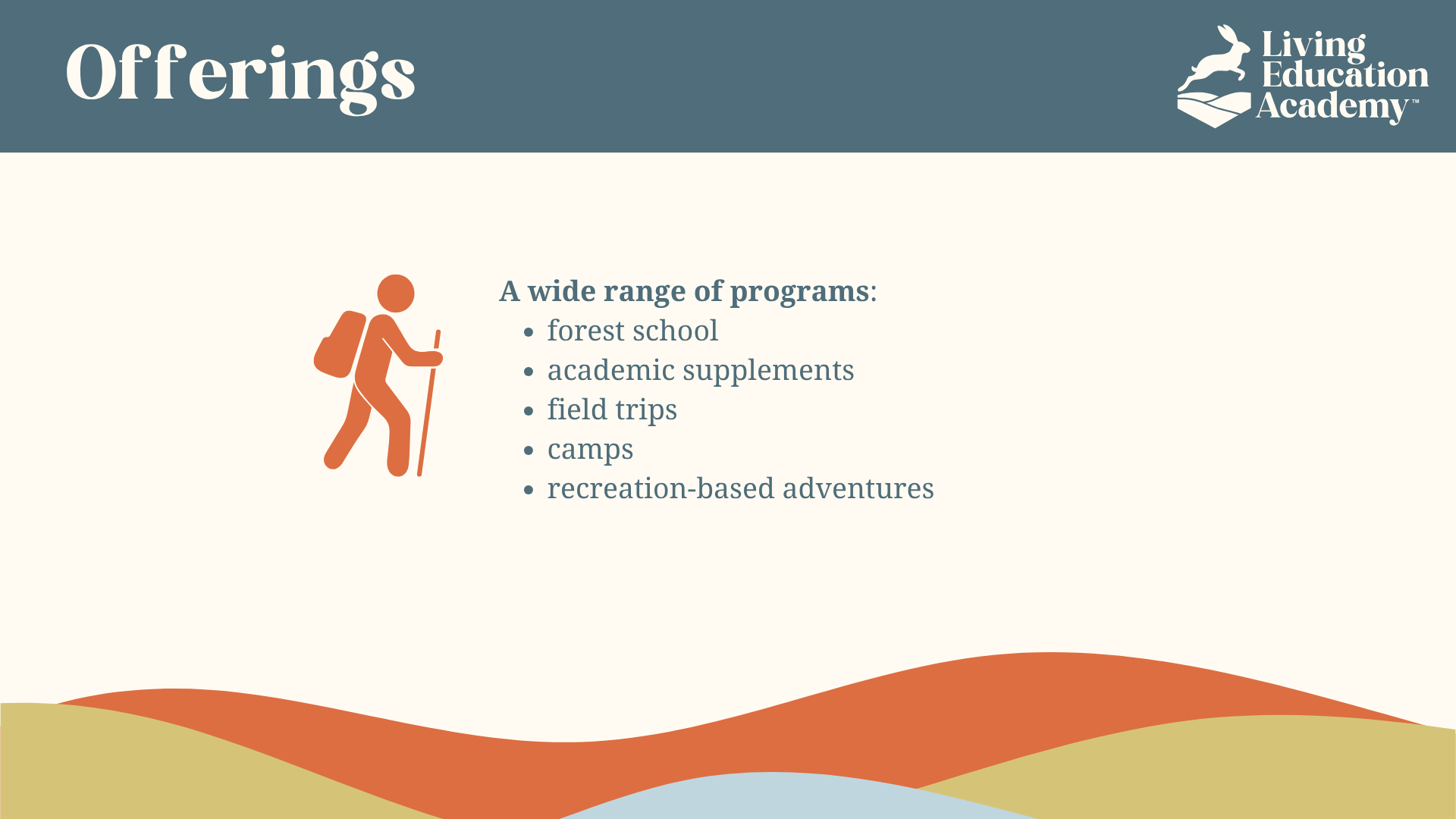
- Visual Identity System (logo, typography, color palette)
- Brand Voice & Messaging Guidelines
- Brand Guidelines
- Audience Persona Development & Positioning Framework
- Survey Testing for Logo Selection
- Go-To-Market Strategy for Planned September 2025 Launch
Challenge
The founder had a strong mission but no cohesive visual or verbal identity to express it. The brand needed to bridge two worlds—academic credibility and outdoor authenticity—in a way that resonated with millennial mothers seeking alternatives to traditional education.
The challenge was creating a system that felt professional enough to earn parents’ trust while remaining natural, approachable, and true to the philosophy of outdoor learning.
Approach
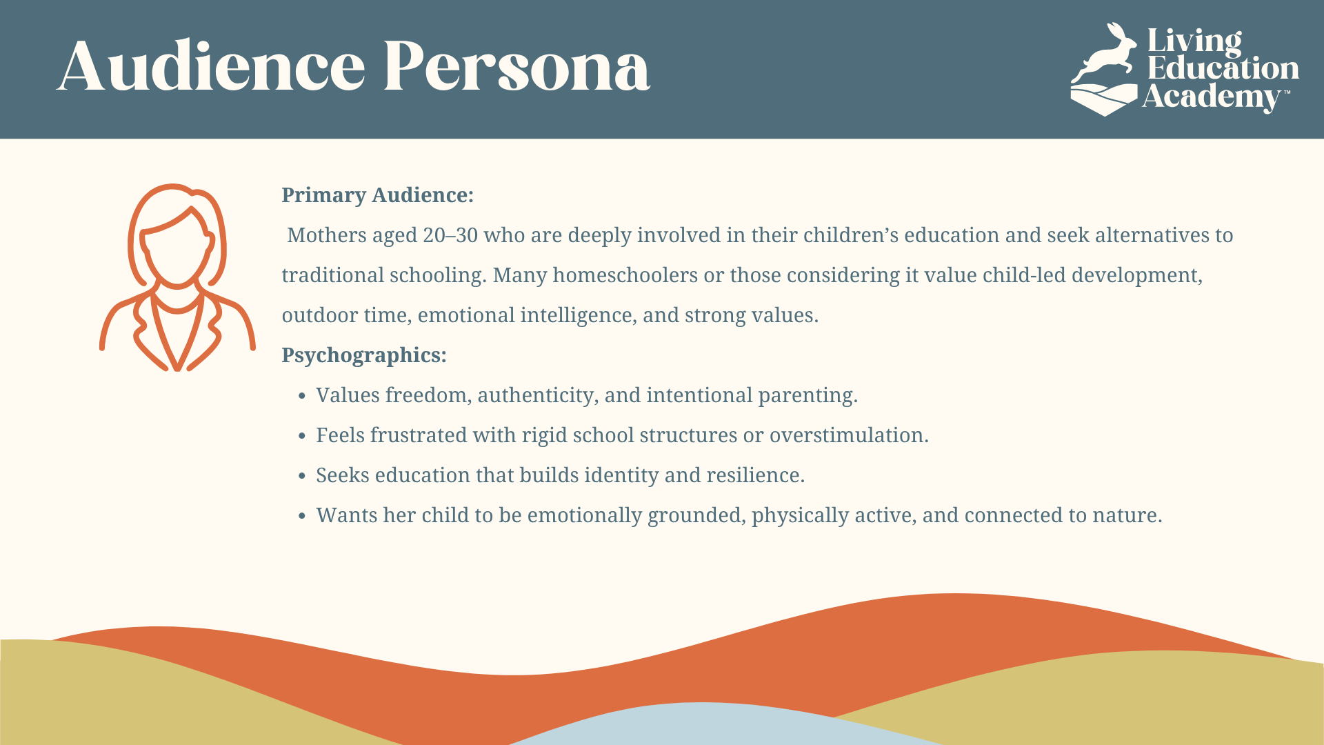
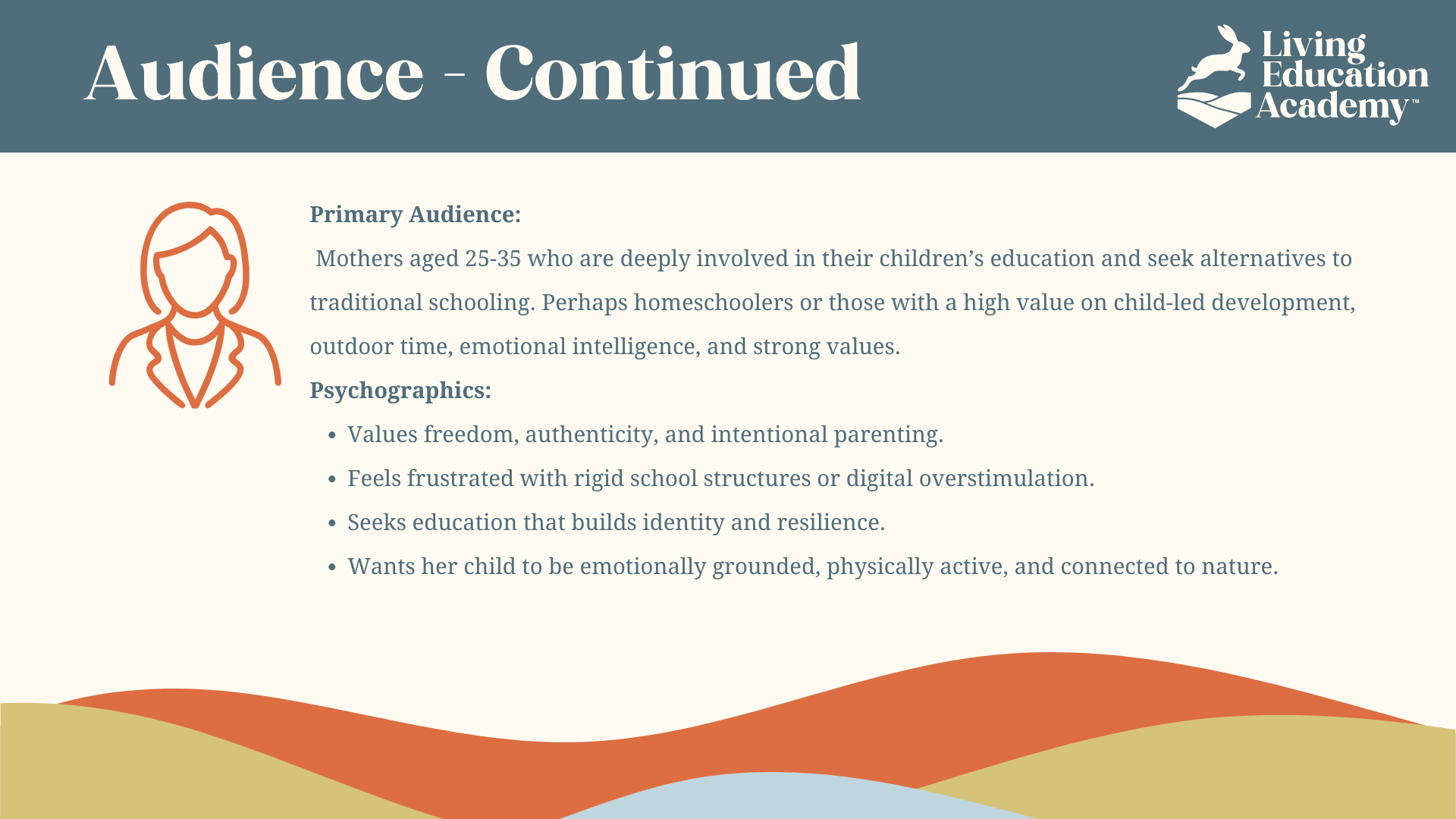
I began by independently conducting discovery interviews, competitive analysis, and audience research to understand the motivations and concerns of homeschool families across Utah County. The research pointed to a strong desire for freedom, emotional growth, and meaningful community experiences—especially among mothers aged 25–35 who prioritize intentional parenting and connection with nature.
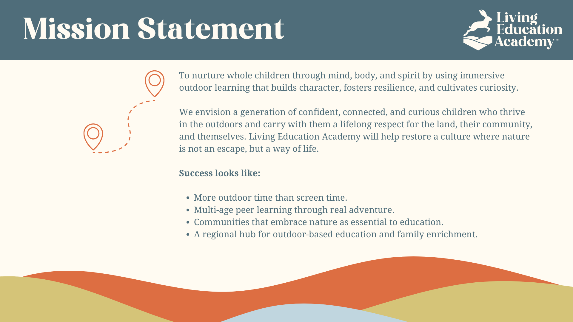
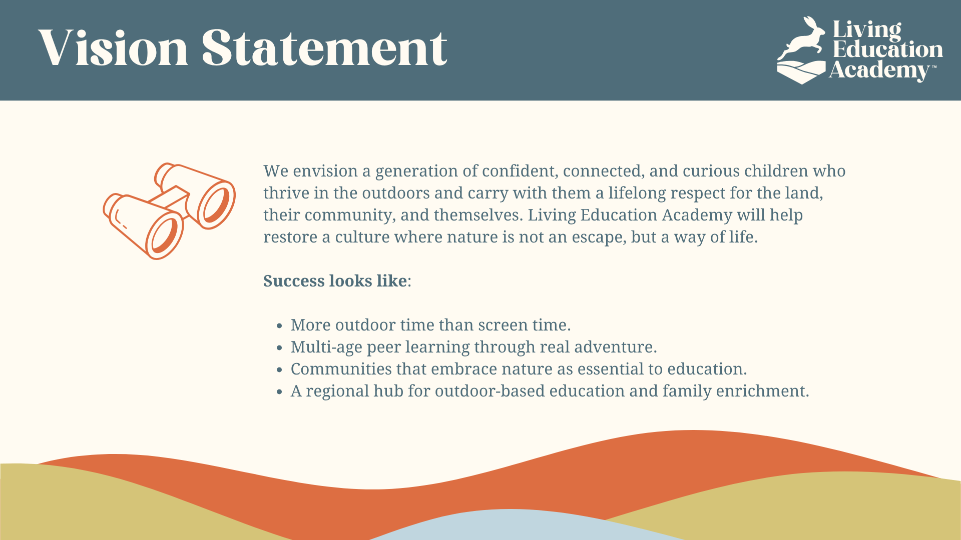
I translated those findings into a brand framework built around one central premise: “the best classroom has no walls.” That idea became the strategic filter for the positioning, visual identity, voice, messaging, and launch planning that followed.
Strategy Development
Positioning:
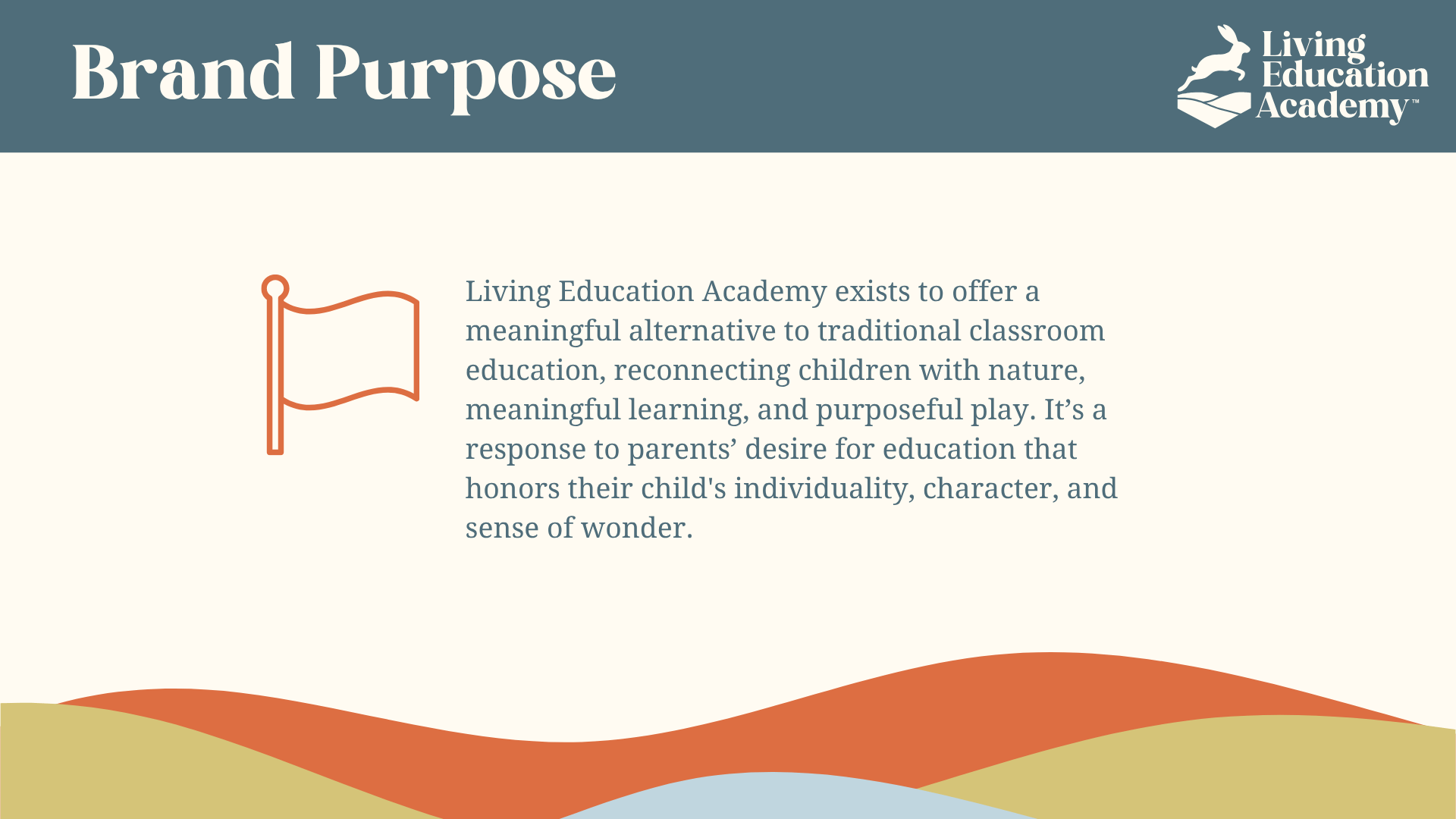
A holistic outdoor learning academy blending academic enrichment, character development, and community building.
Unlike traditional schools or unstructured playgroups, Living Education Academy stands at the intersection of education, exploration, and emotional intelligence.
Audience Persona:
The Conscious Mama — millennial and early Gen Z mothers seeking balance between structure and freedom. They value curiosity, mindfulness, and real-world experiences that shape resilient, confident children.
Voice:
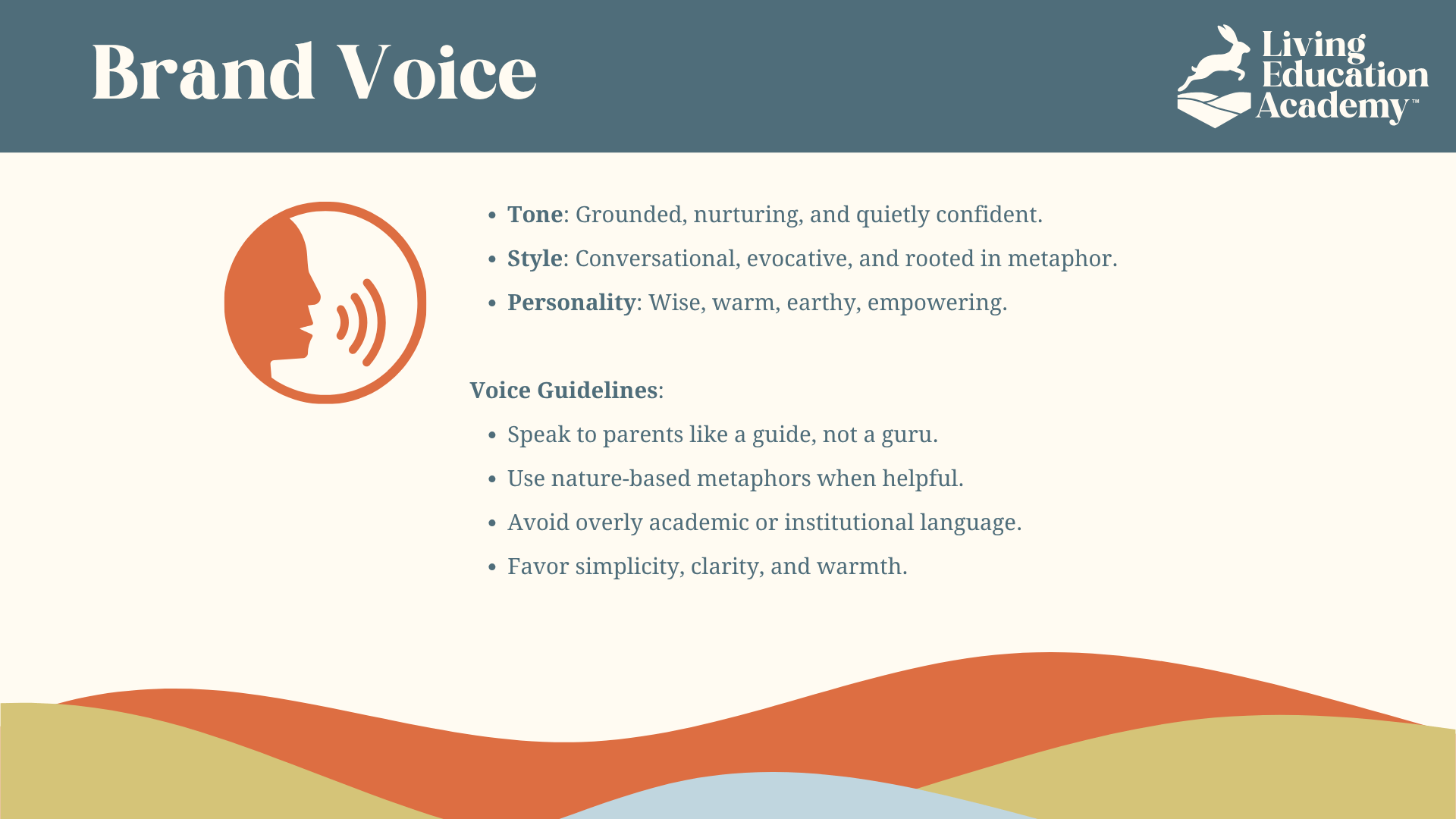
Grounded, warm, and empowering.
Speaks as a guide, not a guru, using nature metaphors and simple, evocative language that feels approachable and wise.
Creative Direction
Logo Design:
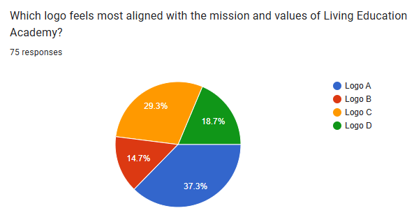
I developed multiple identity directions, then used a community survey to understand how respondents interpreted each concept. The feedback revealed the words and associations people connected with the different designs as well as which logo direction resonated most strongly.
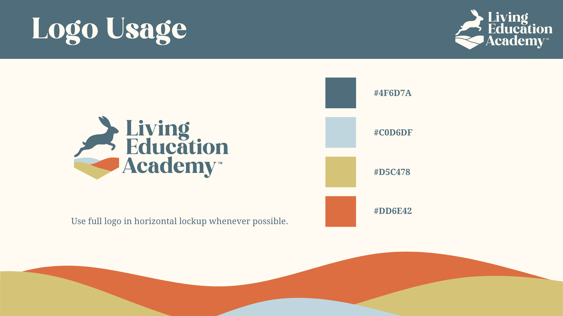
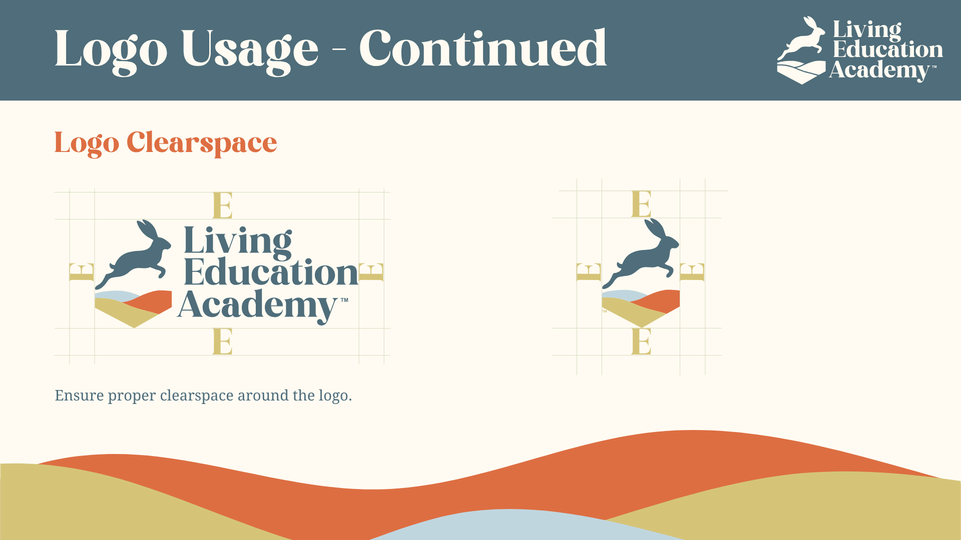
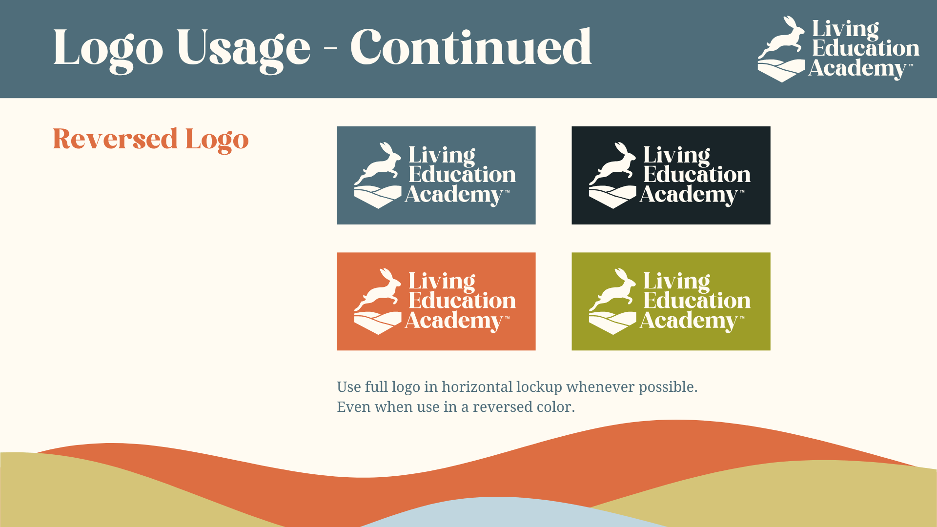
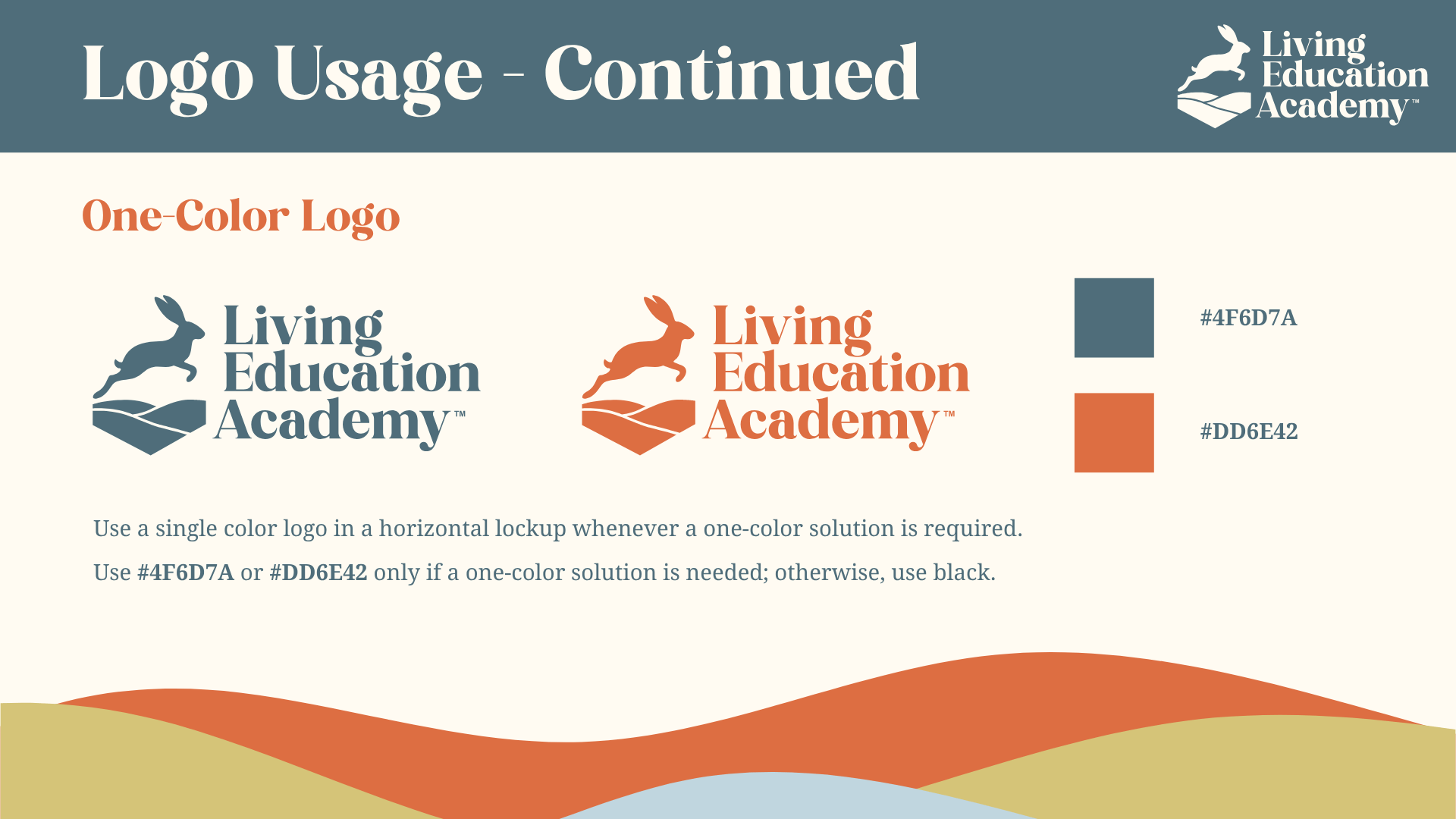
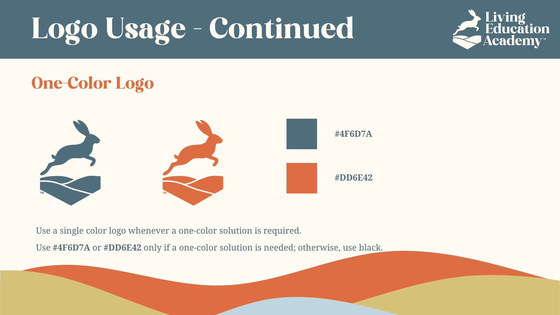
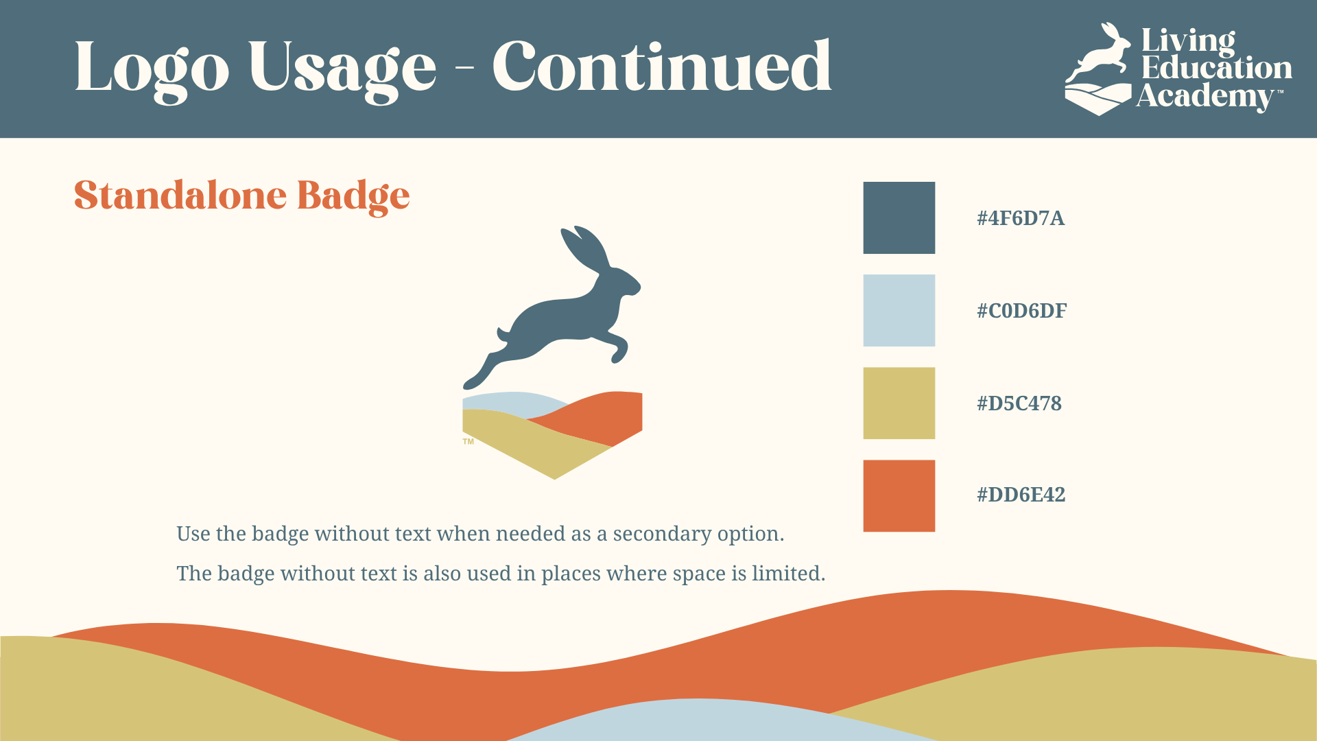
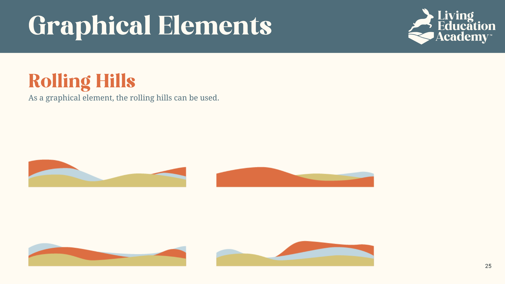
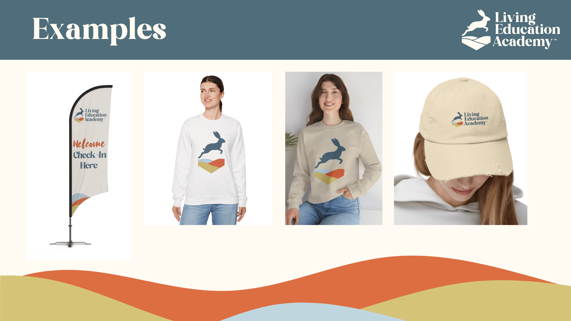
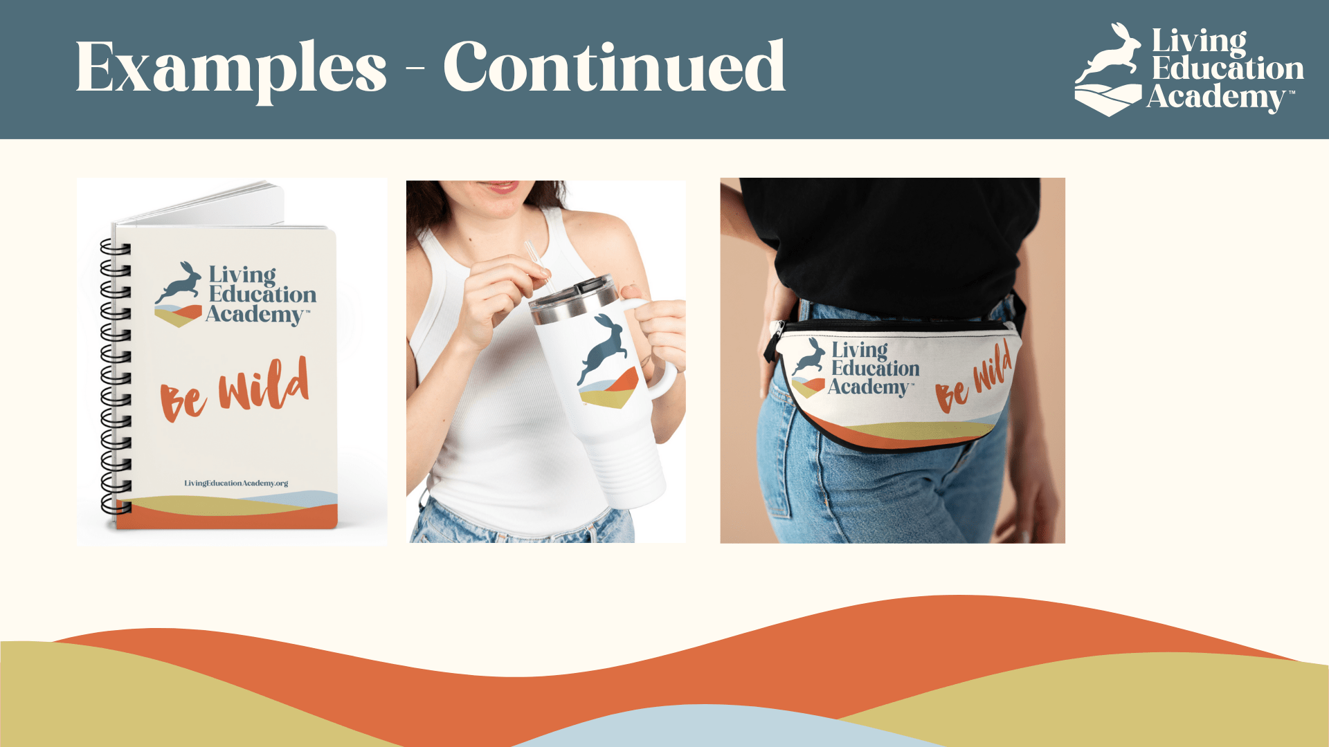
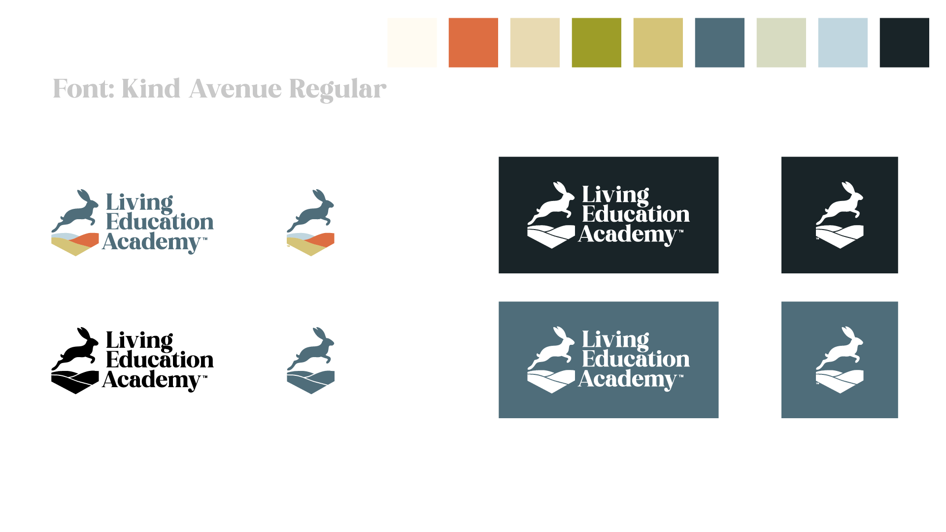
I used those findings as an input in selecting the final direction, balancing audience response with the strategic goal of combining academic credibility and outdoor authenticity. The resulting identity pairs a horizontal lockup with a circular badge and rolling-hills motif to create a flexible system rooted in growth, continuity, and connection to place.
Typography:
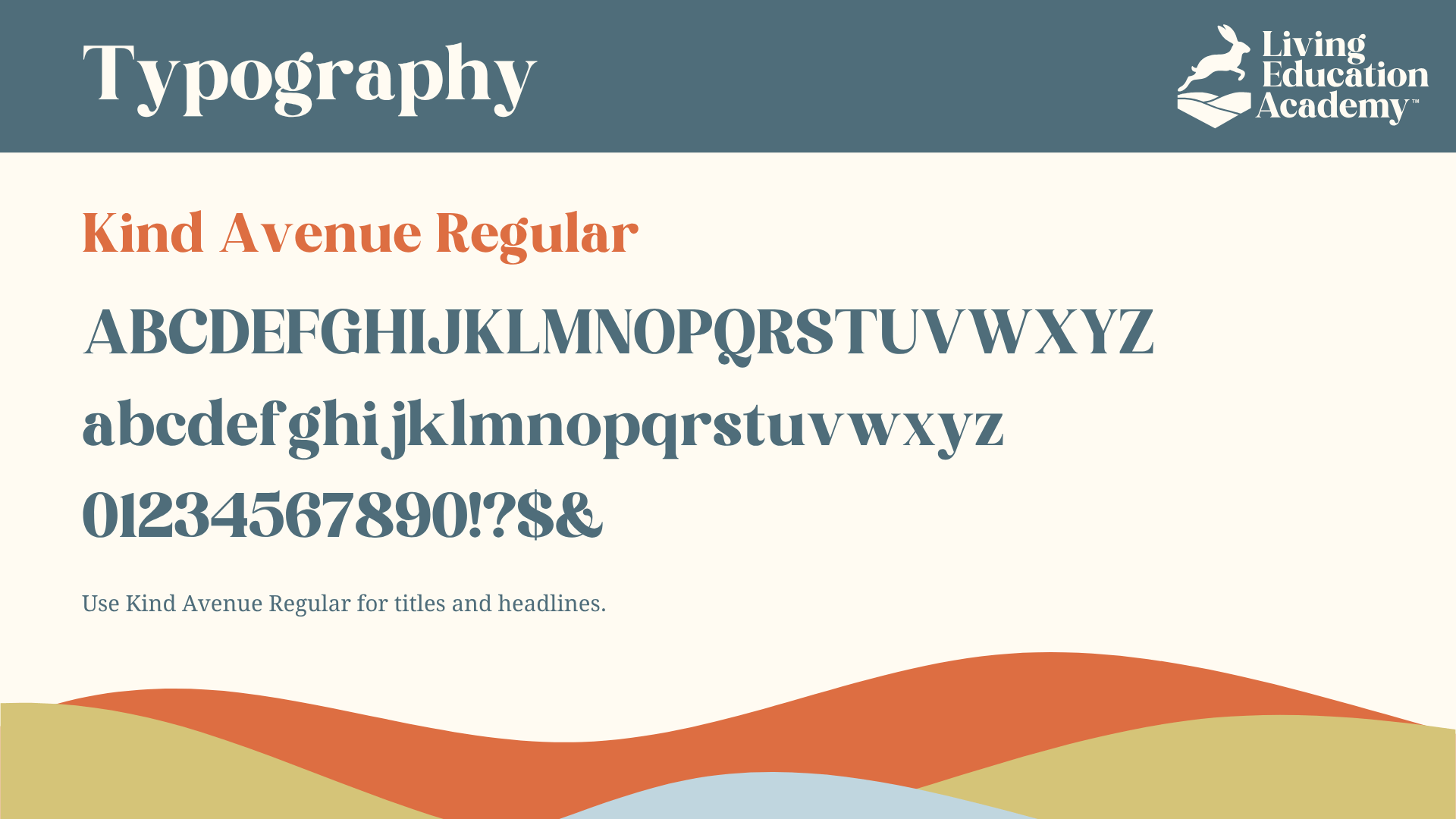
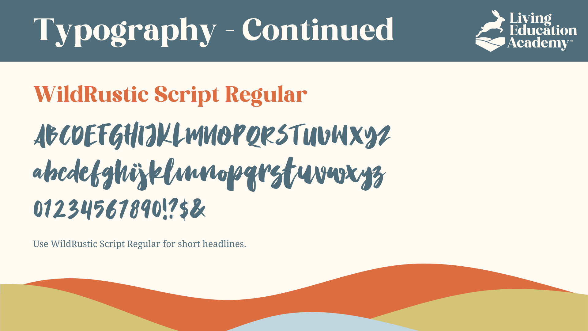
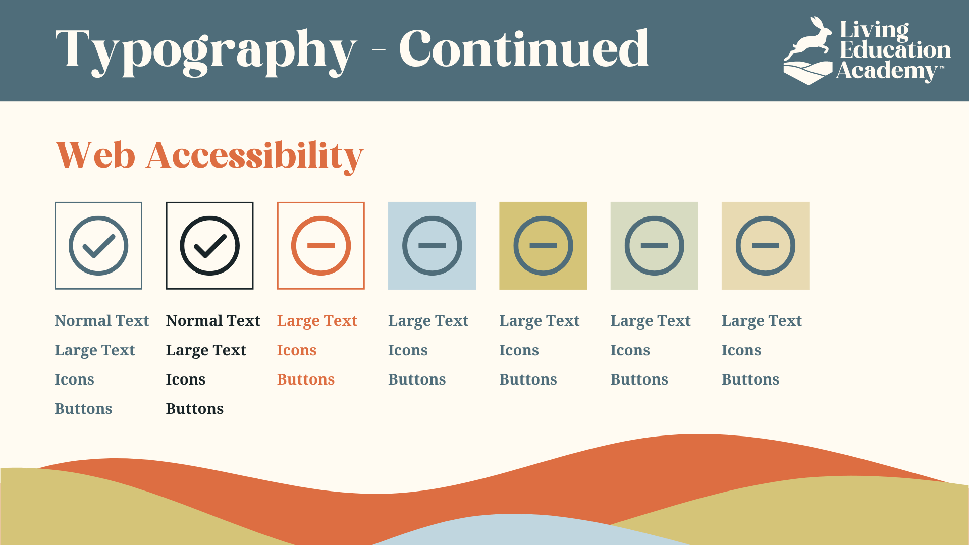
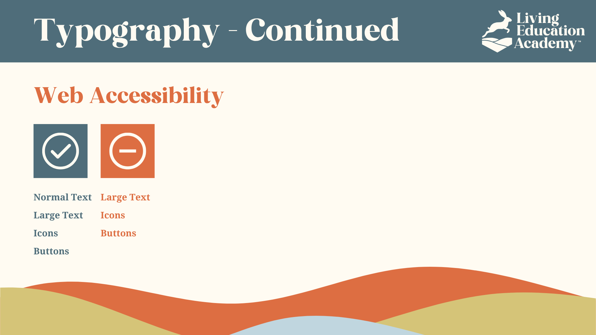
I paired Kind Avenue Regular with WildRustic Script to balance clarity with personality. Kind Avenue provides a modern, confident foundation for titles, while WildRustic introduces a more personal, human note in short headlines. Together, the type system supports a brand that needed to feel credible without losing the warmth and individuality of nature-based learning.
Color Palette:
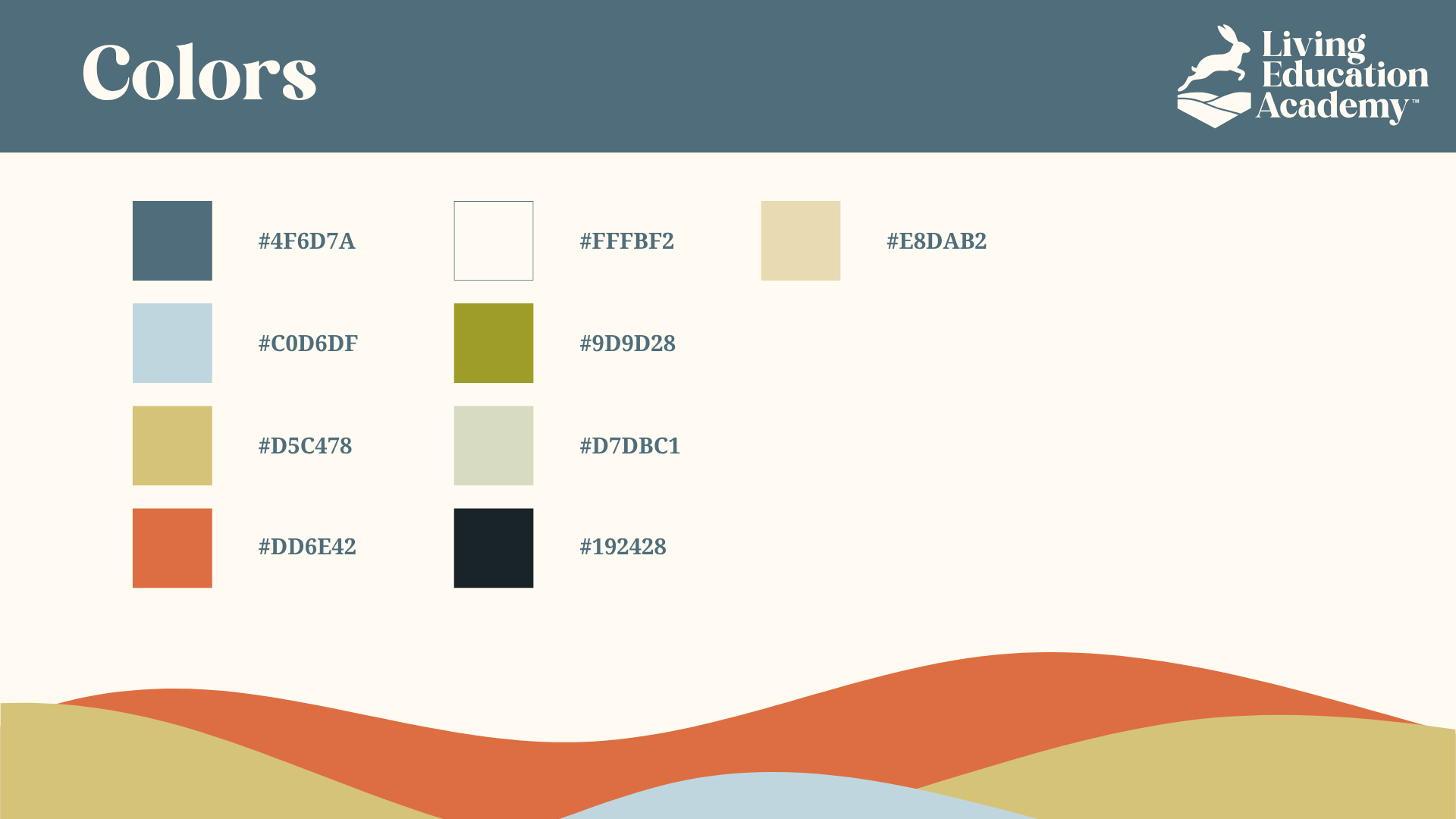
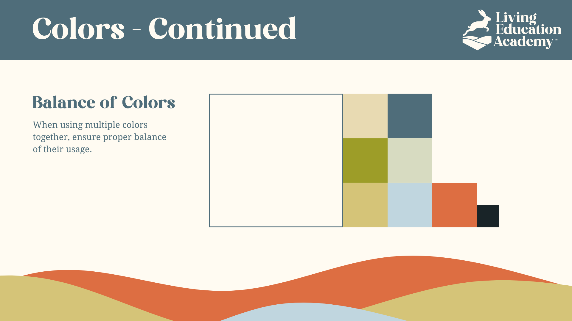
I built the color system around tones drawn from Utah’s desert and mountain landscape, using sage green, warm clay, soft sand, and a muted blue-gray. The palette grounds the identity in a recognizable sense of place while balancing natural earth tones with enough contrast and energy to keep the brand youthful and optimistic.
#9D9D28
#DD6E42
#D5C478
#4F6D7A
Voice and Messaging
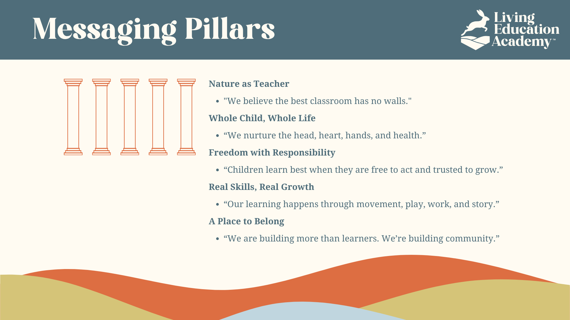
I developed a set of messaging pillars to guide the tone across the brand’s communications, from parent outreach to website copy.
Core Messaging Pillars:
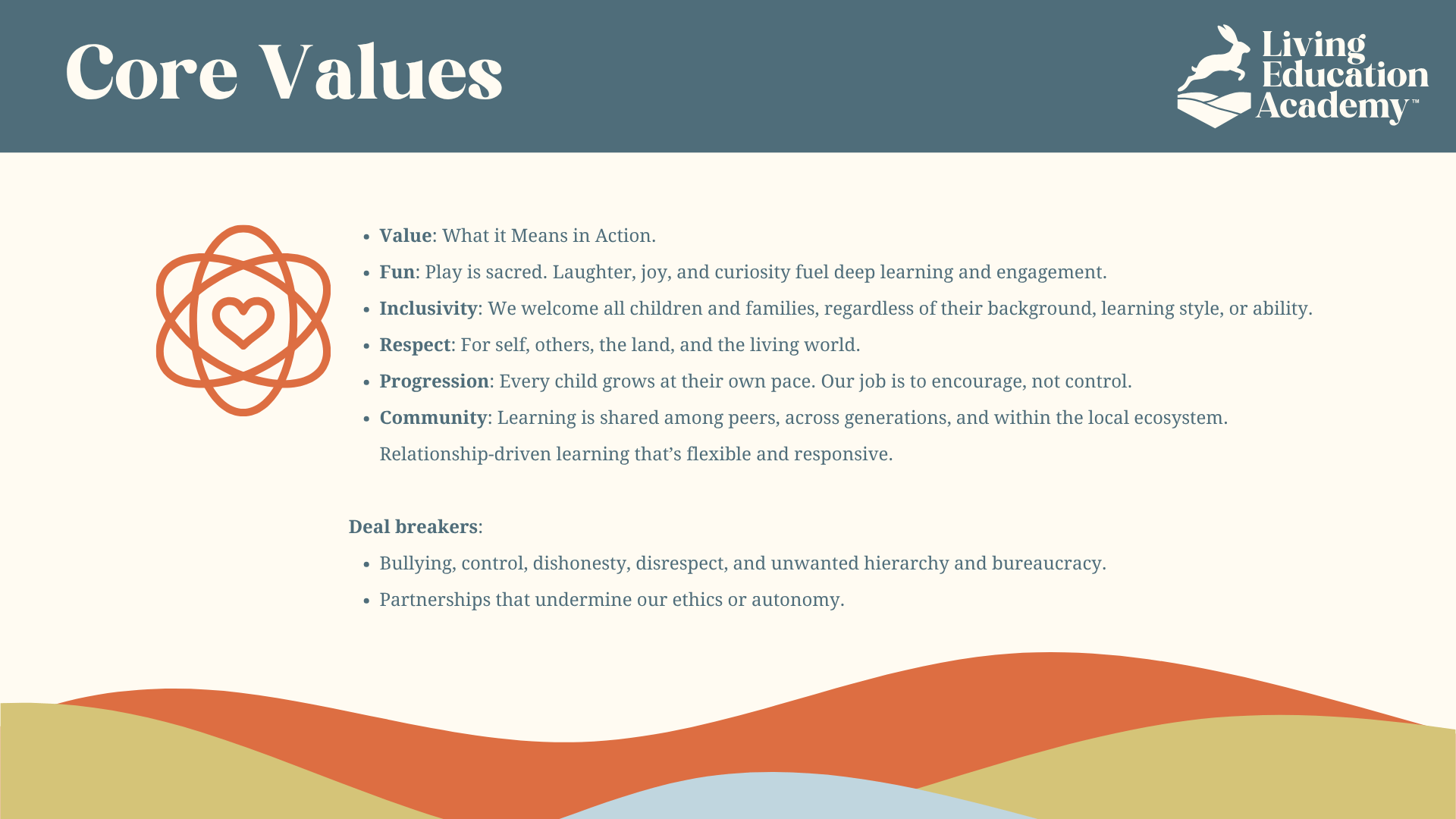
- Nature as Teacher – “The best classroom has no walls.”
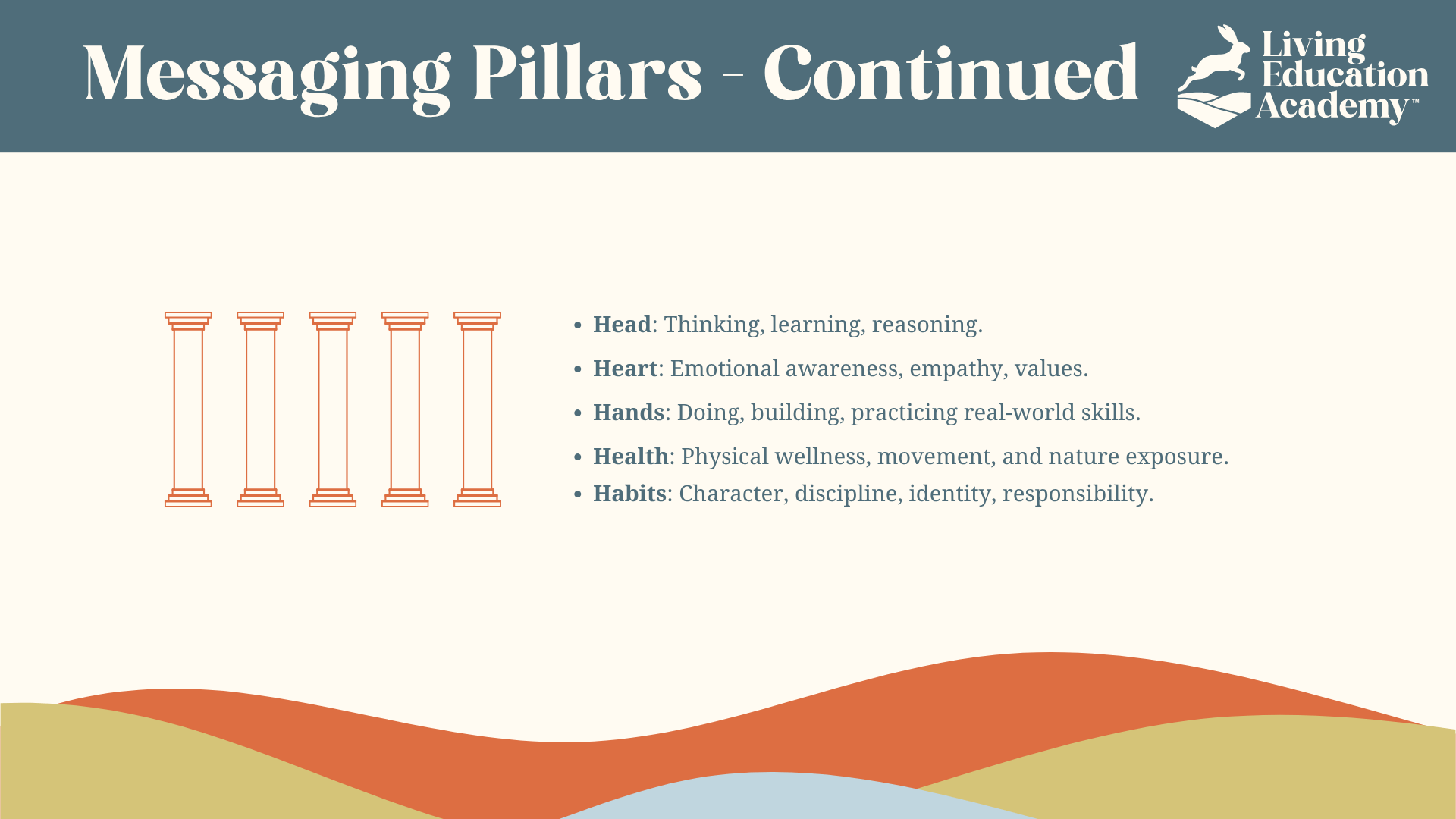
- Whole Child, Whole Life – “We nurture the head, heart, hands, and health.”
- Freedom with Responsibility – “Children learn best when they are free to act and trusted to grow.”
- A Place to Belong – “We are building more than learners. We are building community.”
Each message connects the brand’s emotional promise with practical educational outcomes.
Go-To-Market Strategy
To prepare for the planned September 2025 launch, I developed a grassroots go-to-market strategy focused on building awareness and trust within homeschool and parent communities across Northern Utah County.
Key Tactics Included:
The launch plan centered on:
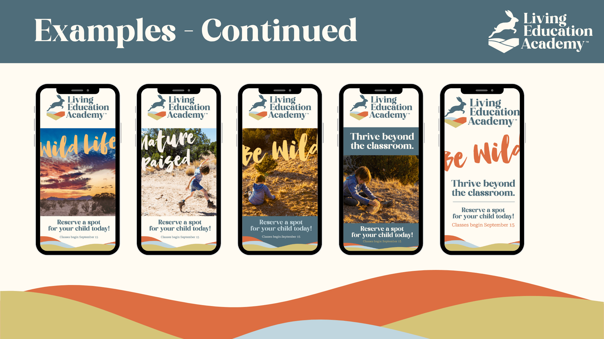
- Facebook and Instagram community engagement
- Partnerships with libraries, local nature centers, and homeschool co-ops
- Referral incentives for founding families
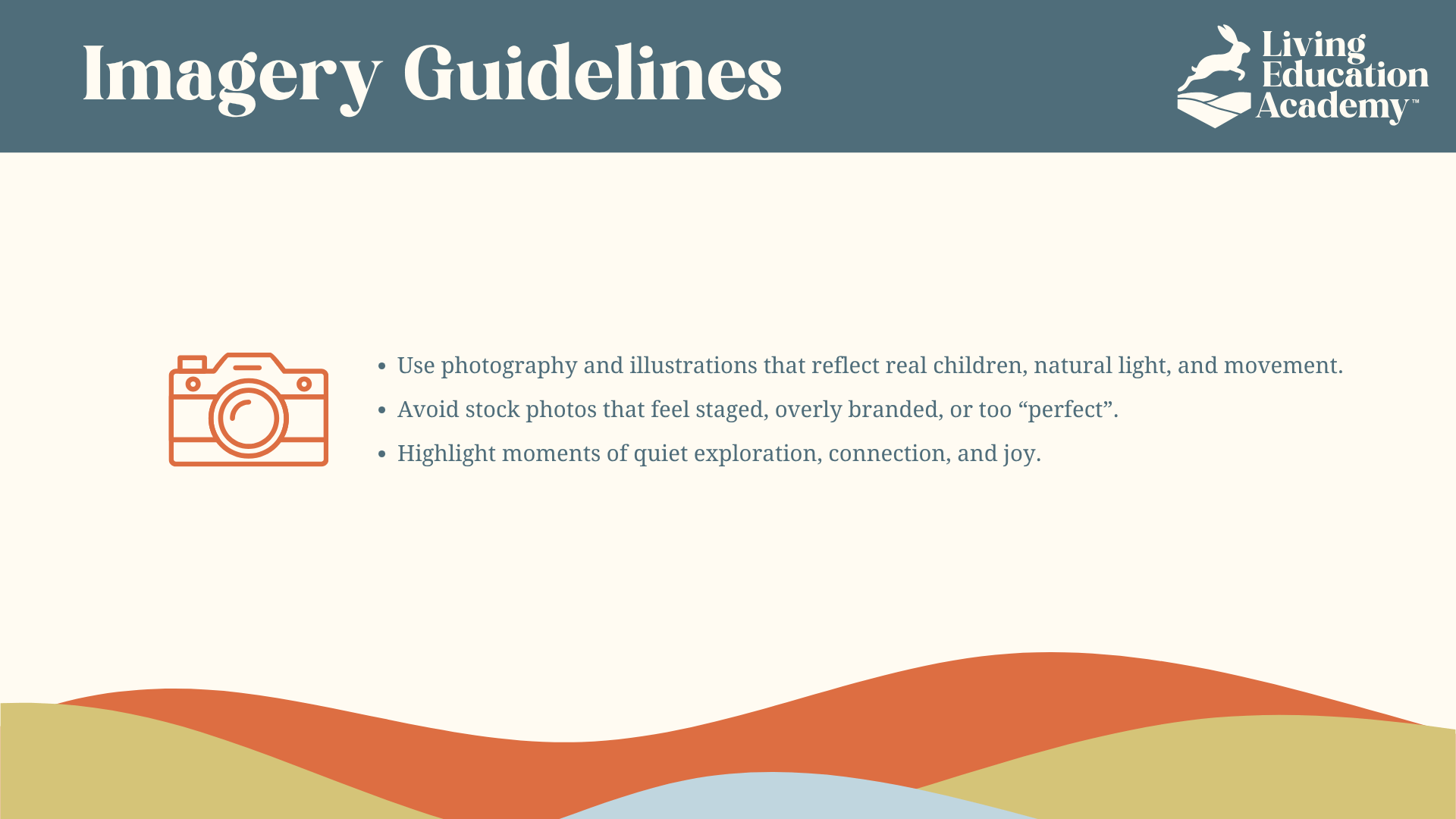
- Story-driven social content focused on real moments of outdoor learning
The strategy was designed to introduce Living Education Academy as more than an education provider. Partnerships, referrals, and community-focused storytelling would give the founder a framework for building familiarity and trust before asking families to enroll.
Project Status
The brand strategy, visual identity, messaging framework, brand guidelines, and go-to-market plan were completed, but the founder ultimately chose not to move forward with the planned launch. Because Living Education Academy did not enter the market, the go-to-market strategy was never executed and there are no launch or performance results to report.
The completed work represents the full strategic and creative foundation developed for the concept, from initial research and positioning through a launch-ready brand system and marketing plan.
Reflection
Working independently across research, strategy, identity, messaging, validation, and launch planning allowed me to carry the same strategic premise through every stage of the engagement rather than treat each deliverable as a separate design exercise.
The logo survey was especially valuable as an external check on creative judgment. It showed both which direction resonated most strongly and what language respondents associated with the concepts, giving me another source of evidence to consider alongside the brand strategy when selecting the final identity.