Project Snapshot

  • Industry: Sports, Events, Youth Culture
  • Audience: Youth, Teens, Young Adults
  • Theme: Halloween
  • Location: Utah
  • Role: Creative Direction, Brand Identity, Illustration, Production Design
  • Deliverables: Festival + Race Identity, Poster, Merchandise Concepts
  • Project Status: Commissioned work. Final artwork was delivered to the client, but the event was canceled before launch and the pieces were not produced.

Challenge

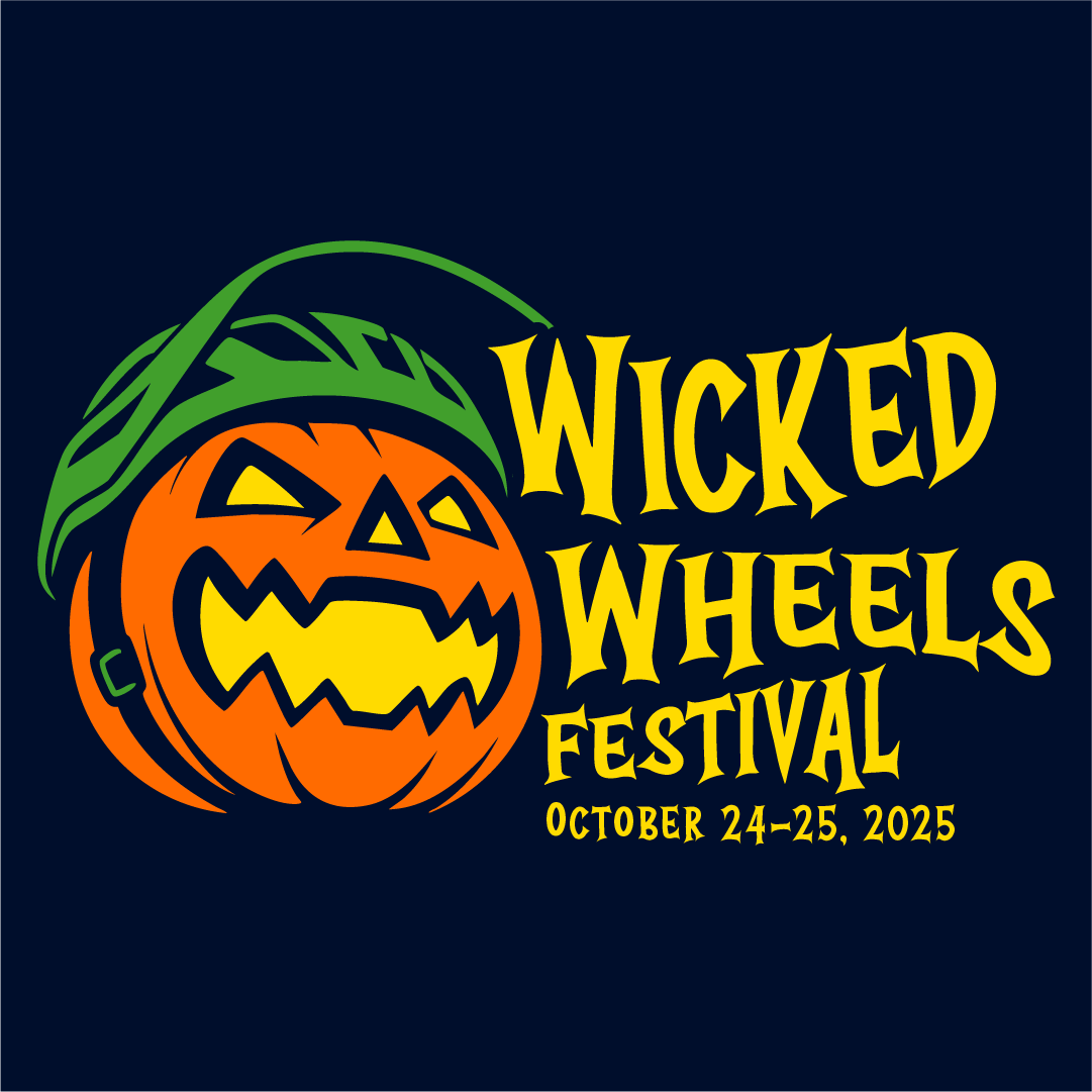
The commission began with little more than an event name and date. I needed to establish the creative direction from the ground up: define a visual approach that could connect Halloween with bike and pump track culture, create a recognizable identity for the main festival, and develop a related race sub-brand that felt distinct without becoming disconnected from the larger event.

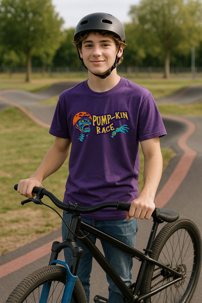
The system also needed to work across potential event, merchandise, and promotional applications, with artwork that could remain recognizable at a glance and reproduce effectively in limited colors.

Creative Direction & Identity System

I owned the concept and design process from initial exploration through final artwork. With no established visual direction to inherit, I developed the creative strategy, explored multiple concepts, selected the core idea, and built the festival and race identities as one connected system.

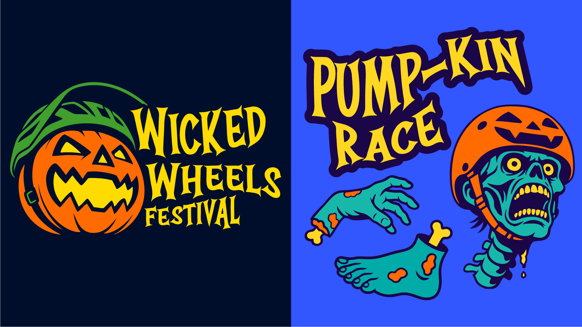
  • Core Concept: I landed on the jack-o-lantern helmet by combining two familiar ideas that normally would not appear together. Merging Halloween imagery with bike culture created a simple visual concept that could communicate the character of the event quickly.
  • Visual Language: Thick line work, flat vector shapes, and a limited neon palette gave the identity a bold, high-contrast style that could carry across digital, print, and merchandise applications.
  • Brand System: Wordmarks, badges, patterns, and supporting graphics created a modular toolkit rather than relying on a single logo.
  • Production Planning: I prepared spot-color variants, knockouts, and single-color versions so the artwork could adapt to vinyl, screen printing, and limited-color production.
  • Campaign Planning: Social assets were planned to support event registration and promotion, but I stopped development after learning that the event had been canceled.

The Pump-kin Race

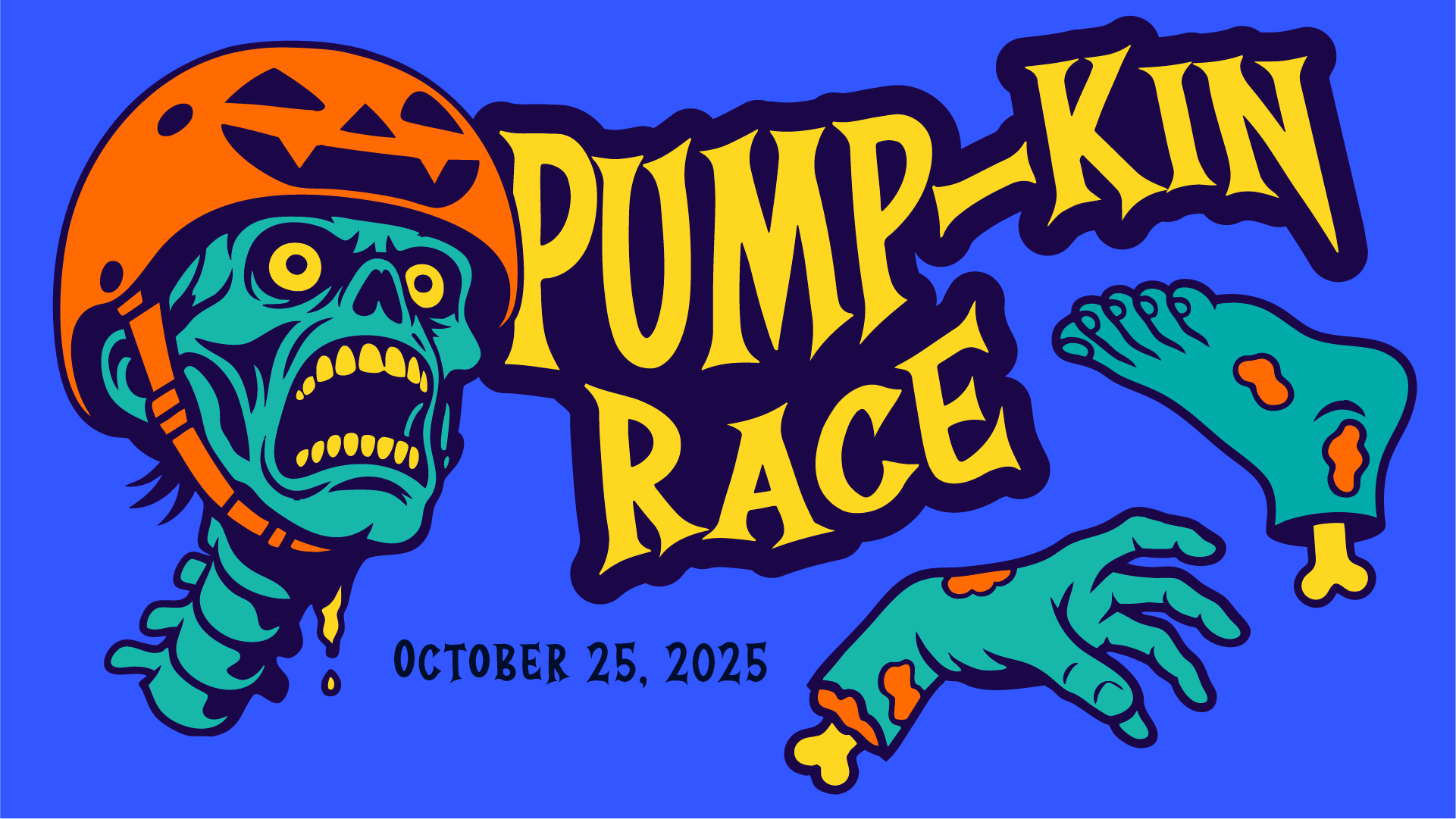
The Pump-kin Race needed enough personality to generate its own excitement while still feeling like part of Wicked Wheels. I treated it as a sub-brand rather than a separate identity, carrying forward the parent brand’s high-contrast color, illustration style, and Halloween character while introducing more motion and a zombie rider to emphasize the energy of pump track racing.

This gave the race its own visual voice without breaking the connection to the larger festival.

Final Artwork & Applications

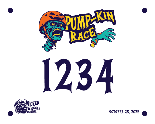
Race Bib

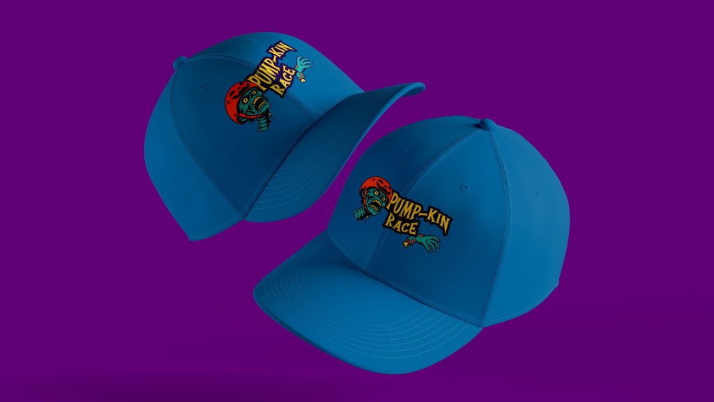
Hats

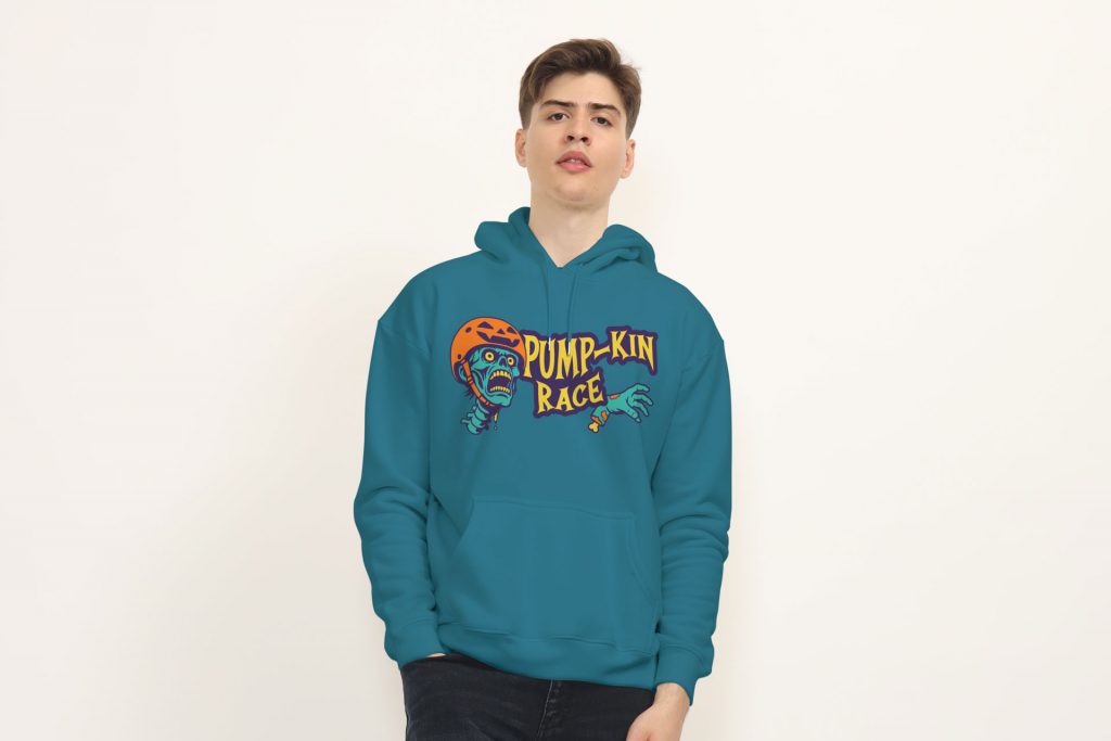
Hoodie

Share

LinkedIn
X
Email
Facebook
Telegram