
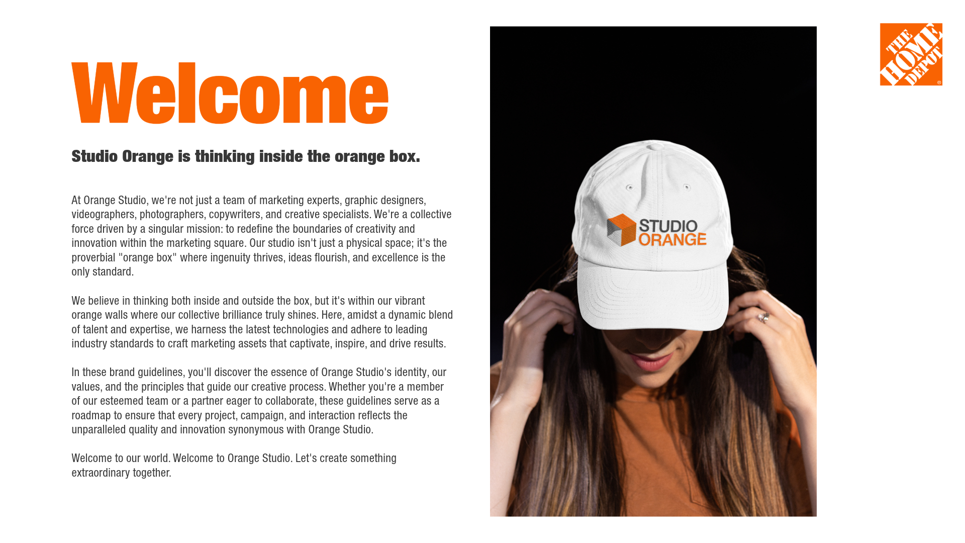


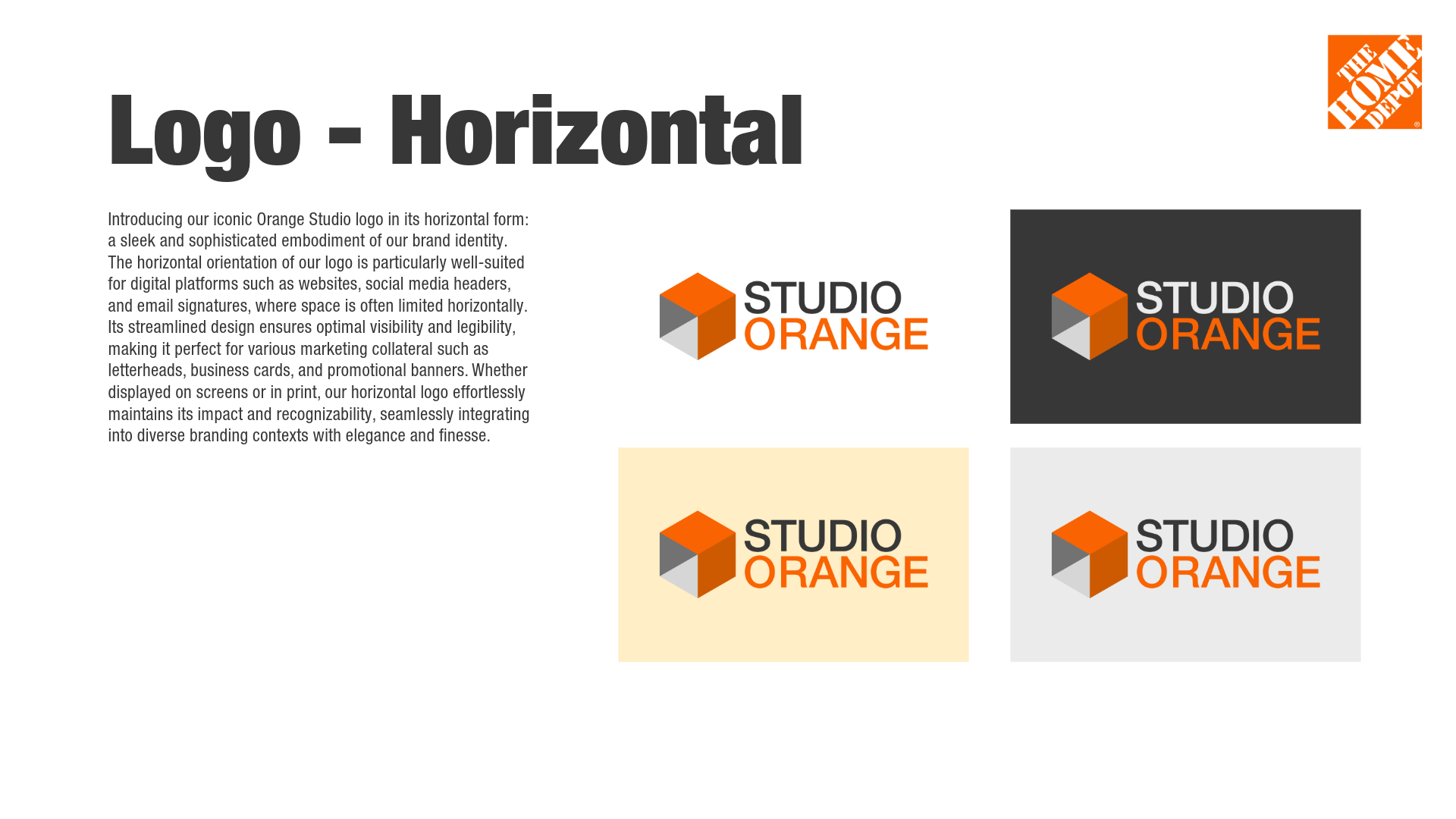
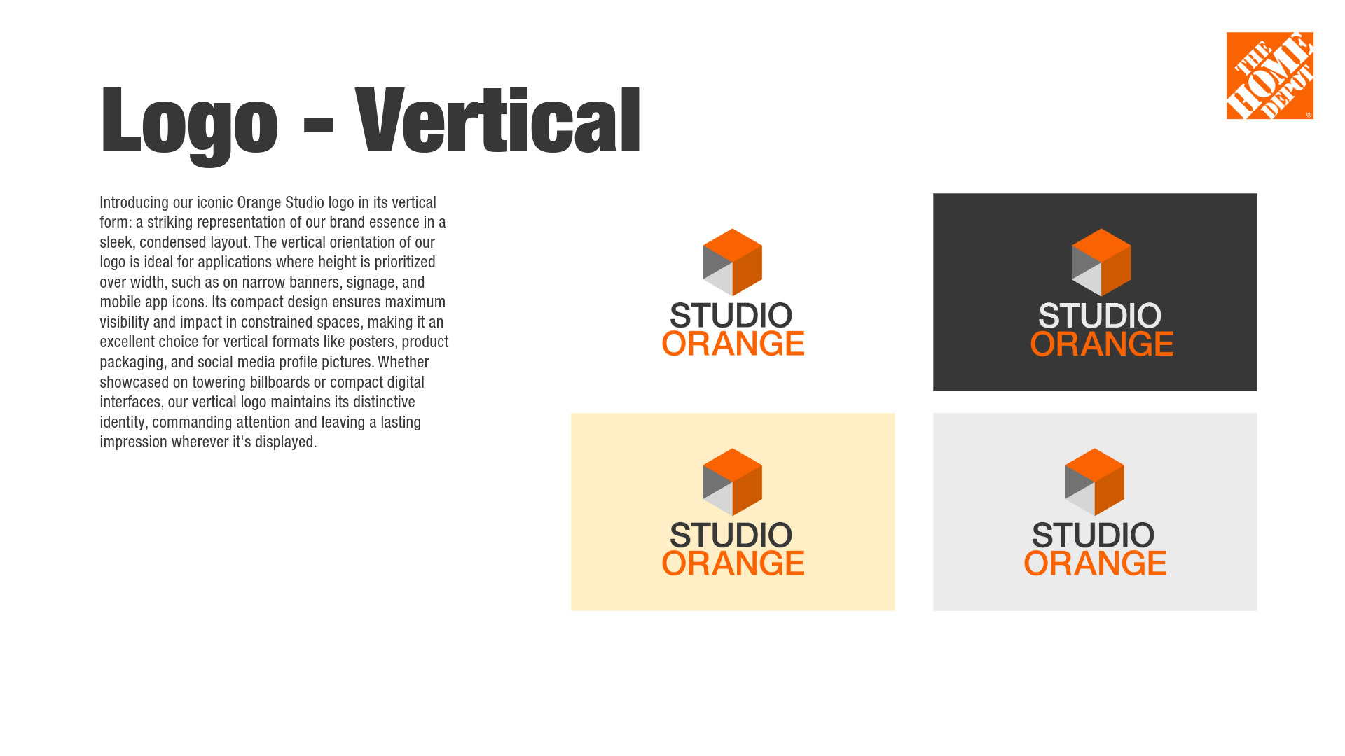

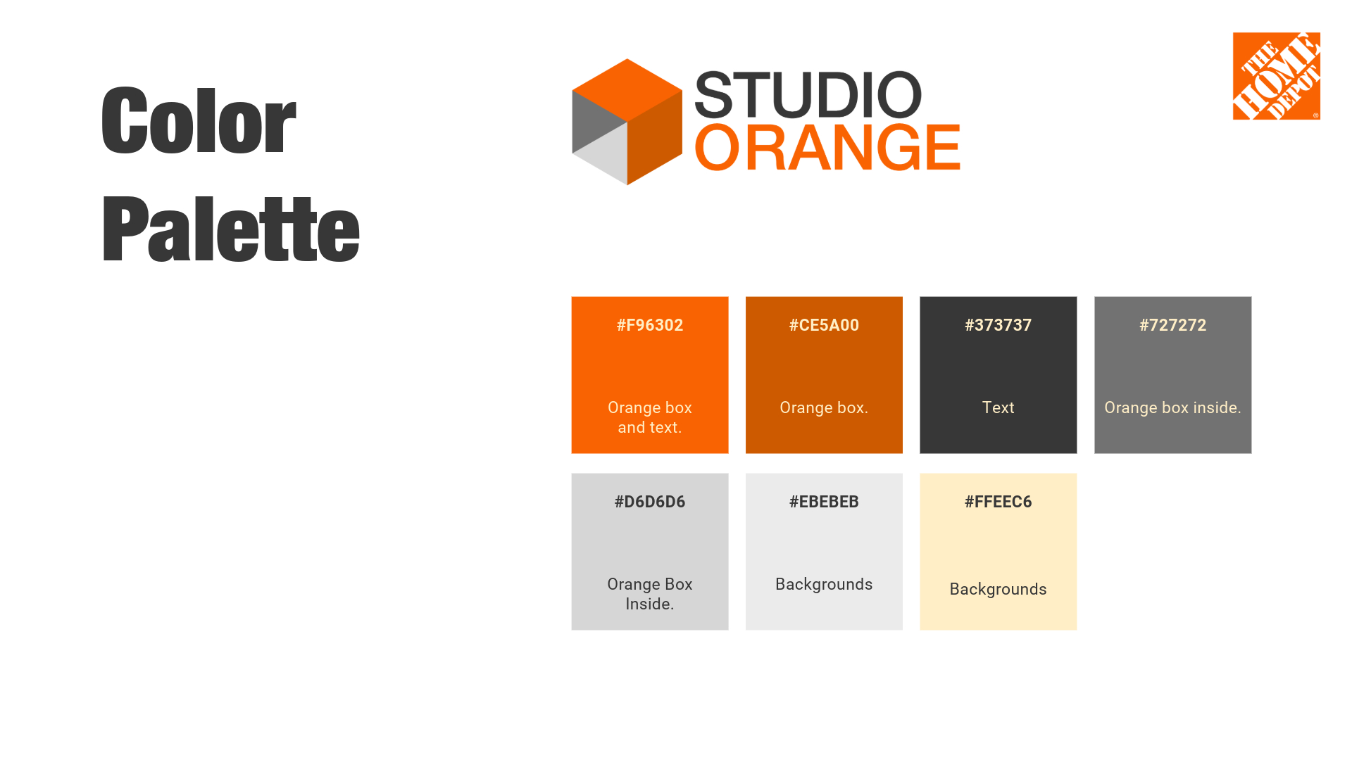

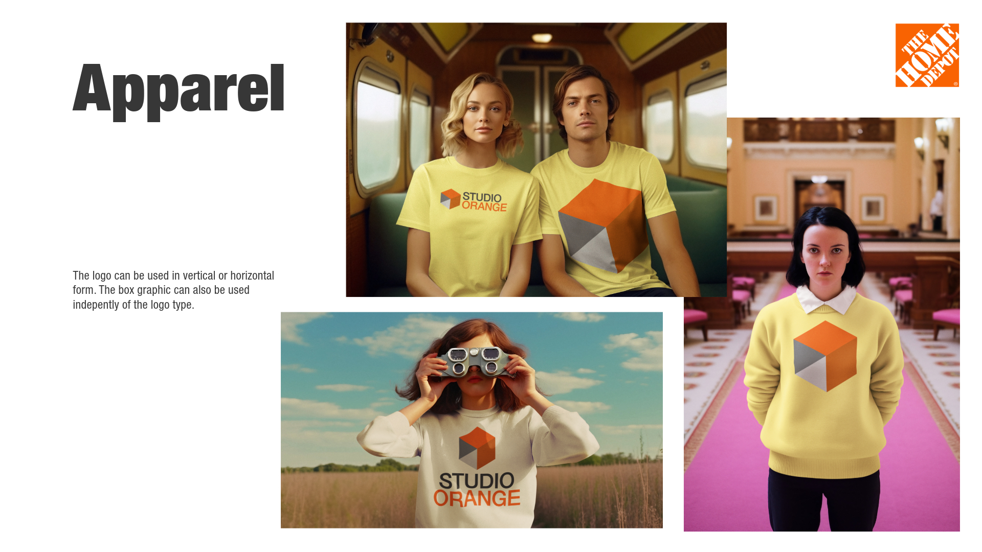

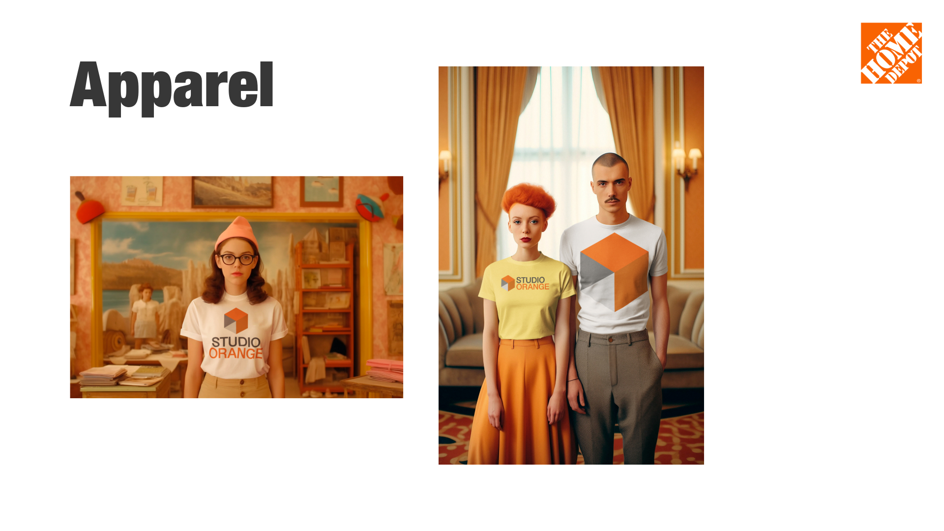
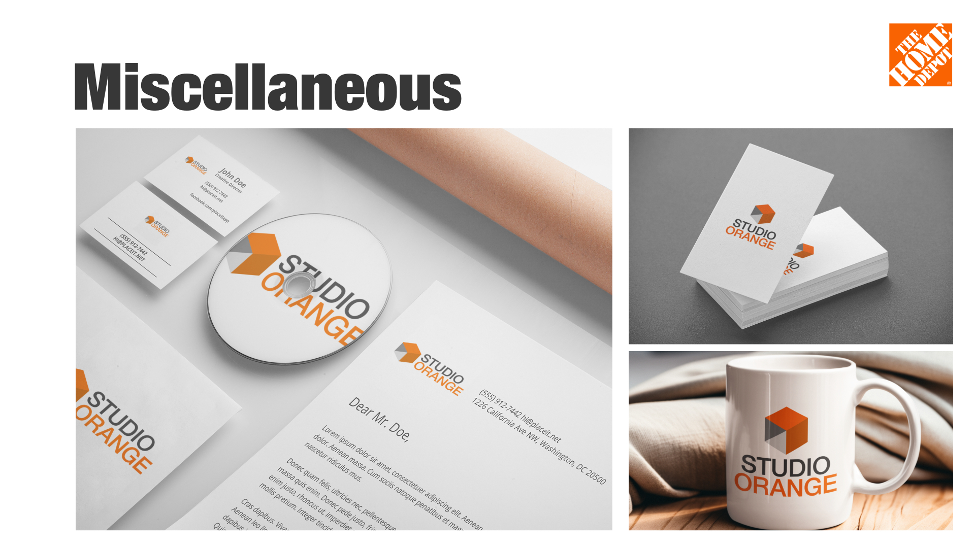
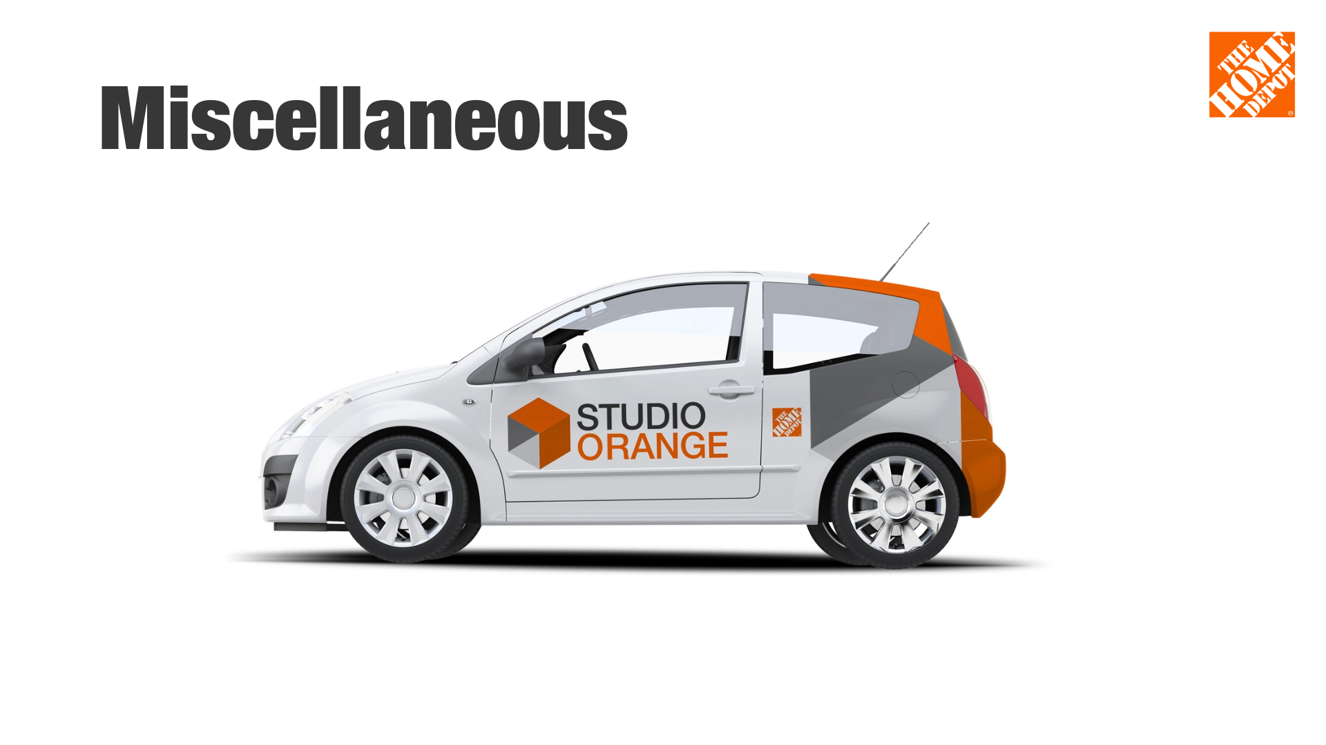

The Home Depot needed an identity for Studio Orange, its internal studio for photography, video, and other marketing content. The identity needed to stand apart from The Home Depot’s primary logo without relying on a traditional logo lockup, while still feeling clearly connected to the parent brand.
As the sole designer, I owned the identity from initial research through concept development, presentation, and brand guidelines.
I began by studying The Home Depot’s existing brand identity and visual language to determine which elements could create a recognizable connection without simply reproducing the master brand.
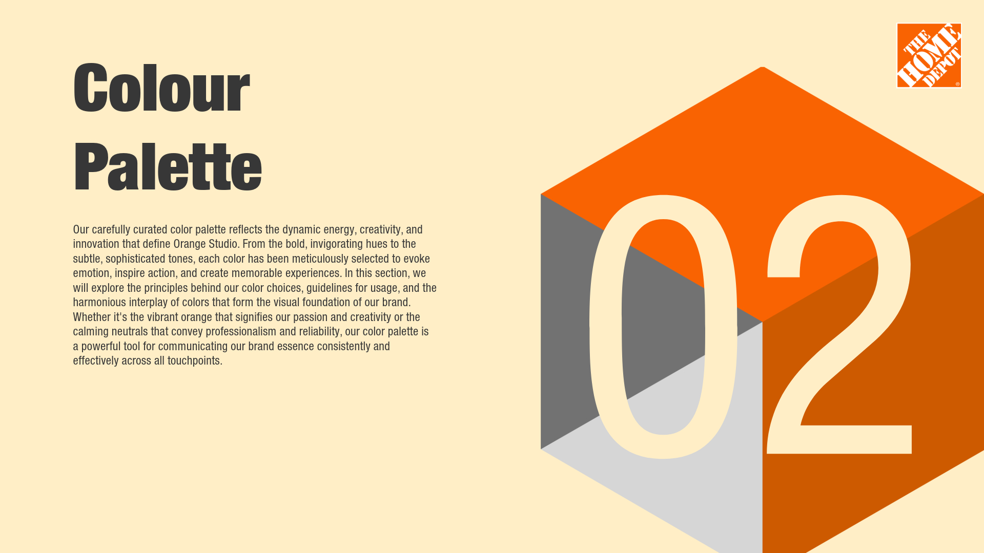
The box became the central design principle. The symbol draws from the squared form of The Home Depot’s iconic box logo, creating a visual relationship between the two identities while allowing Studio Orange to have a distinct mark of its own. From that premise, I developed the identity from scratch, including the typography, color system, supporting visual elements, and guidelines for how the identity should be applied.
I then presented the completed concept in a formal review with senior leaders, peer managers, and designers. The concept was evaluated alongside more than 20 identity directions developed by other designers.
The concept was not selected for final implementation. However, the completed direction established a distinct visual identity for Studio Orange while maintaining a deliberate connection to The Home Depot through the shared box principle.
The project resulted in a fully developed identity concept and supporting guidelines, taking the work from research and strategic framing through design development and formal presentation.